
 London, UK
 CWG Markets CRM
CWG Markets
UI/UX Designer
01 May 2026
United Kingdom
Forex brokerage / FinTech
Project Overview
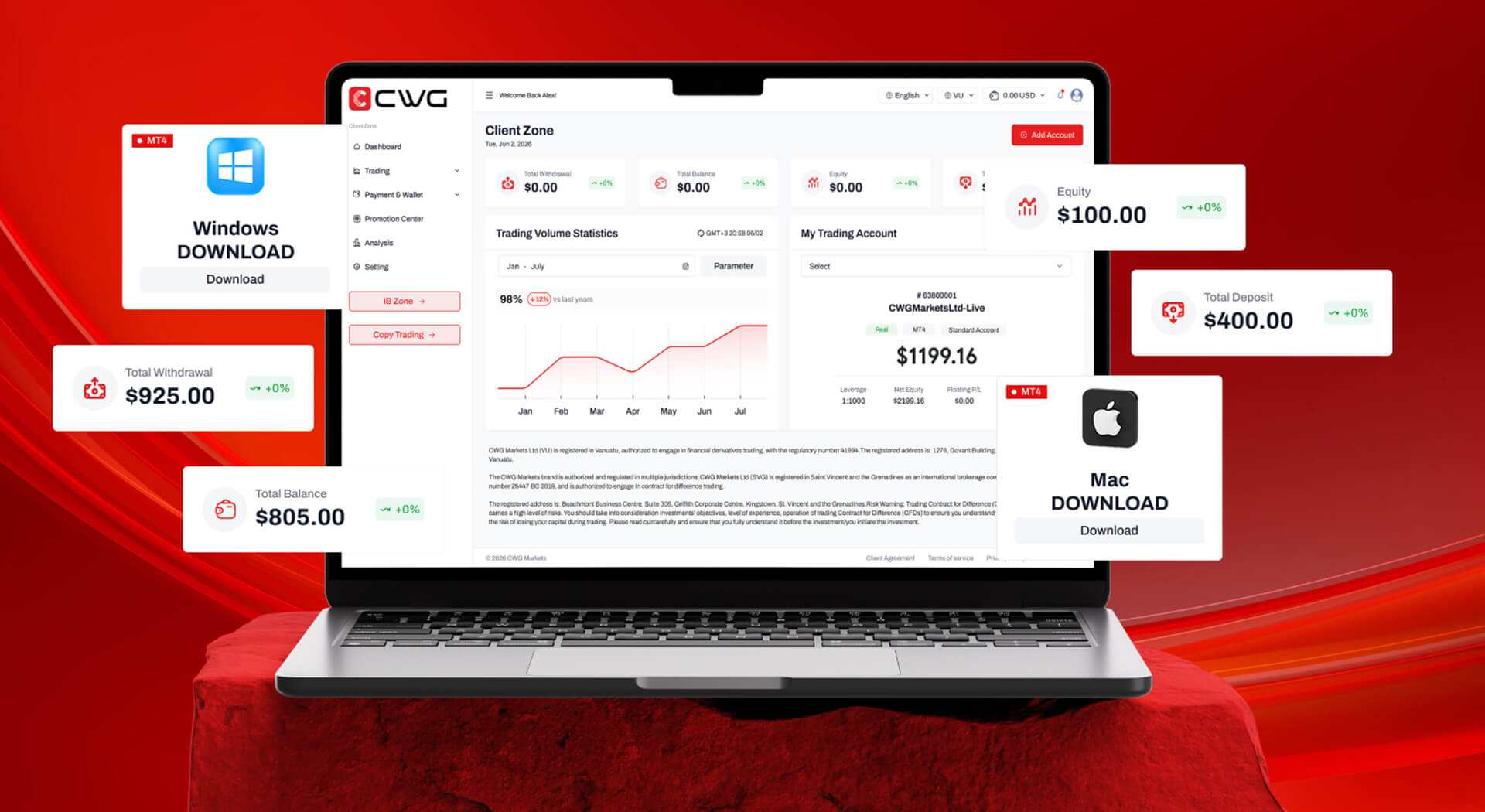
Before the redesign, our reps were spending the first 10 minutes of every call just hunting for the right account. The new CRM gets them to the information they need before the customer even says hello.
Michael R.
Head of Revenue Operations – CWG
Work Overview
APPROACH
Helping sales reps find what they need, faster
72%
48%
40%
Overview
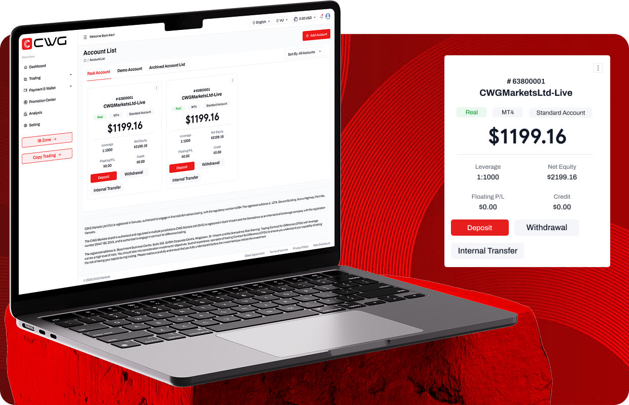
CWG CRM is the internal sales platform CWG Markets’ global teams use to manage leads, track client interactions, and monitor deal pipelines in one workspace. Used by thousands of reps across multiple regions, it had to be fast, intuitive, and ready to scale.
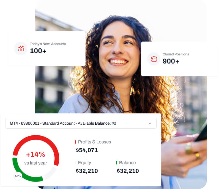
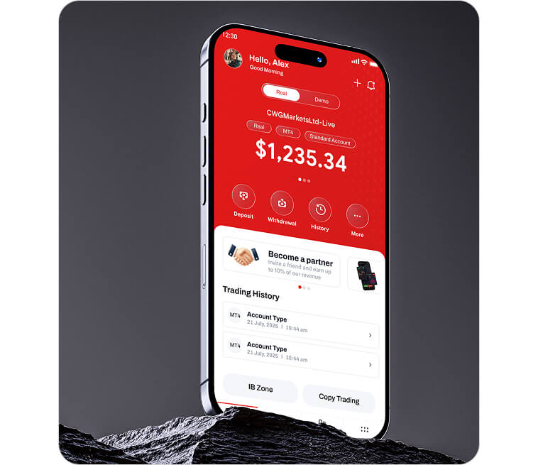
Problem
Why reps struggled with CWG CRM
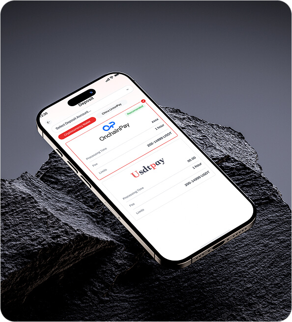
Everyday tasks took too long. Key features were hard to find, common workflows needed extra clicks, and reps lost confidence in the tool, which held back adoption.
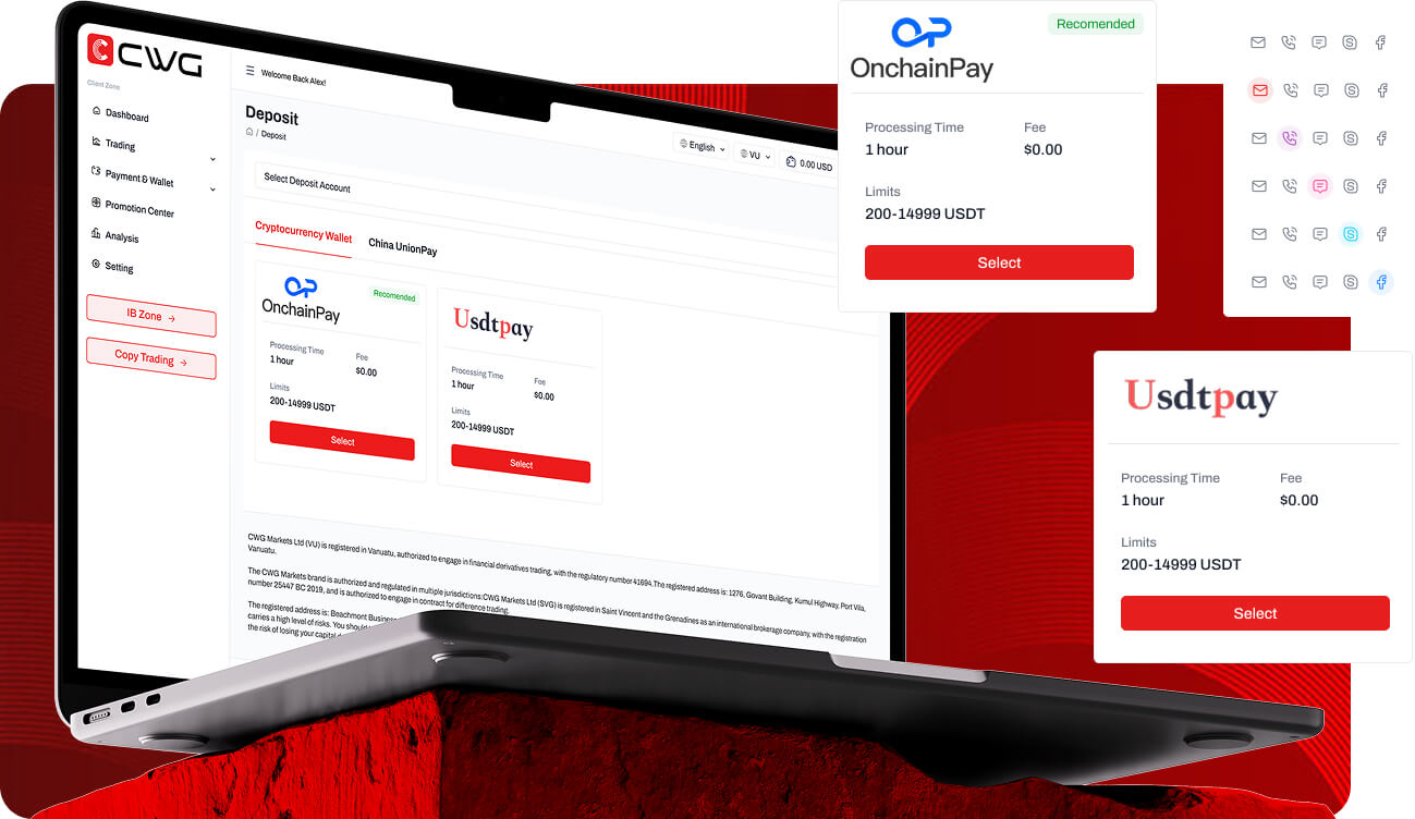
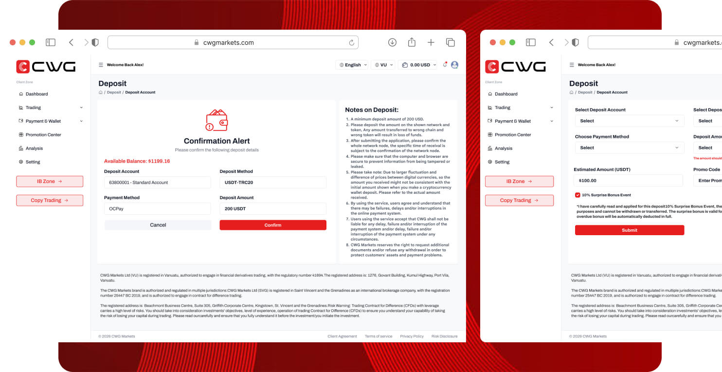

Solution
How I redesigned CWG CRM
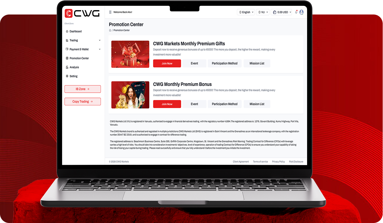
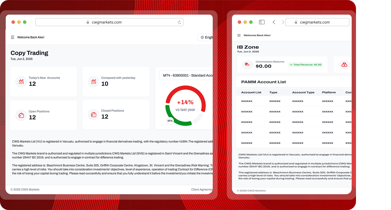
I redesigned CWG CRM end to end to remove friction from everyday sales work. Every decision aimed to simplify workflows and help reps finish tasks with confidence, so the CRM is easier to learn, quicker to navigate, and more pleasant to use.
Process
How I approached the redesign
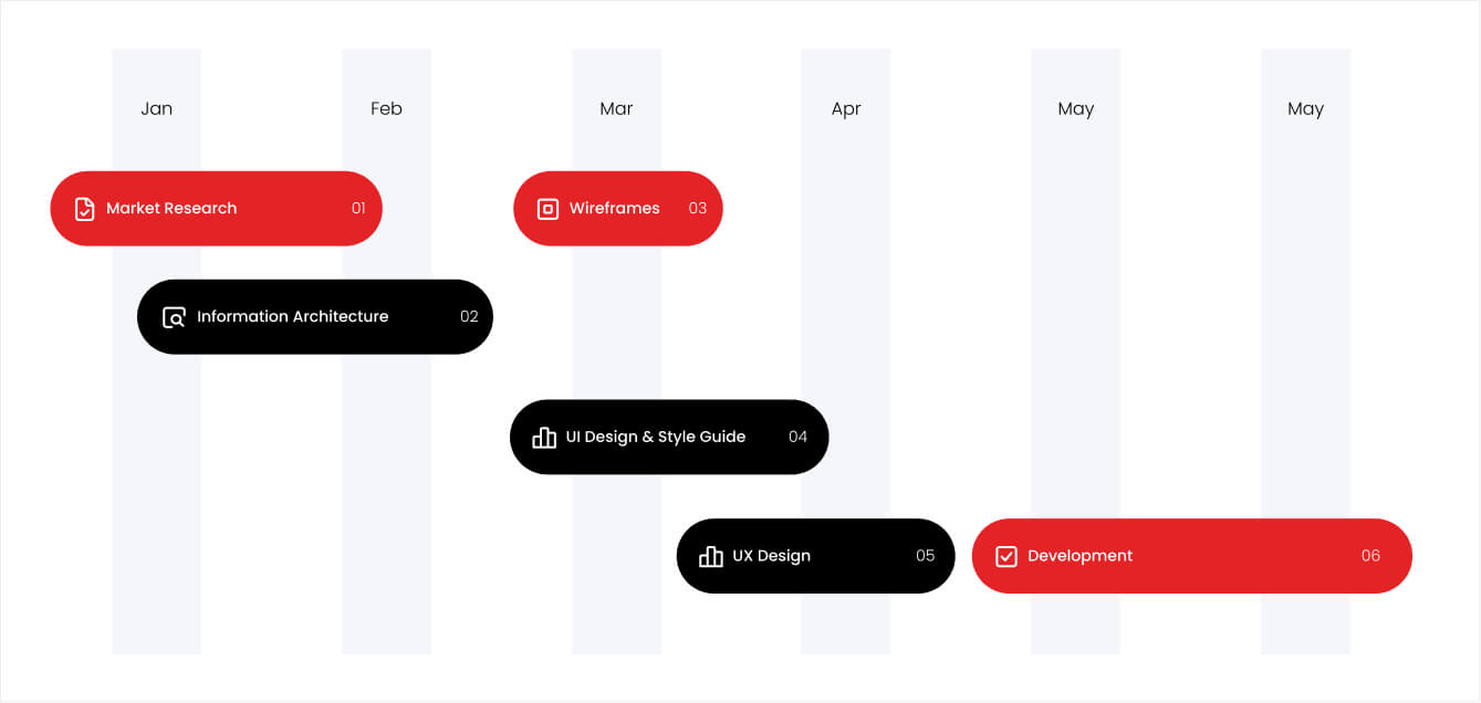
I started by studying how sales teams actually work and where they got stuck. User research, workflow analysis, and iterative design shaped a CRM that is simpler and faster for daily use.
Research & Discovery
I explored how sales teams use CWG CRM, found their pain points, and traced the causes of low adoption and navigation problems.
Information Architecture
I restructured the platform so essential features are easier to find and the user journey is clearer.
UI Design & Prototyping
I designed a clean, intuitive interface, built interactive prototypes, and refined them through continuous feedback.
Testing & Handoff
I validated the new design with users, fixed usability issues, and prepared a complete design system for development.
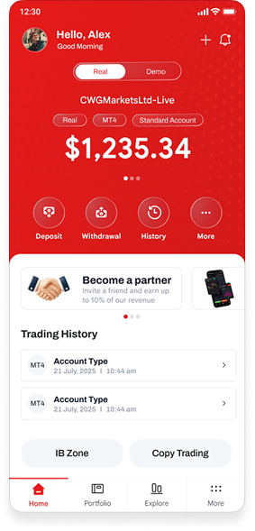
Visual Design
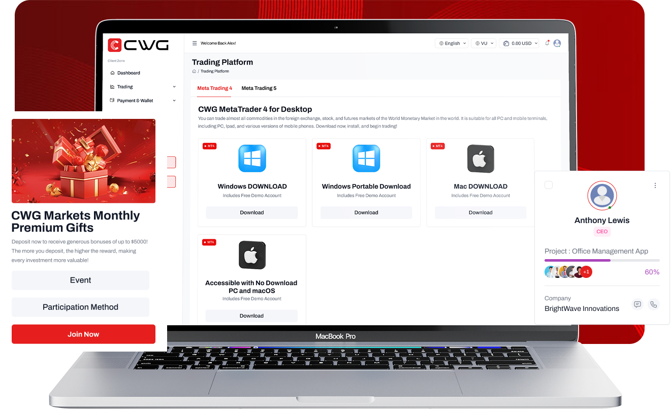
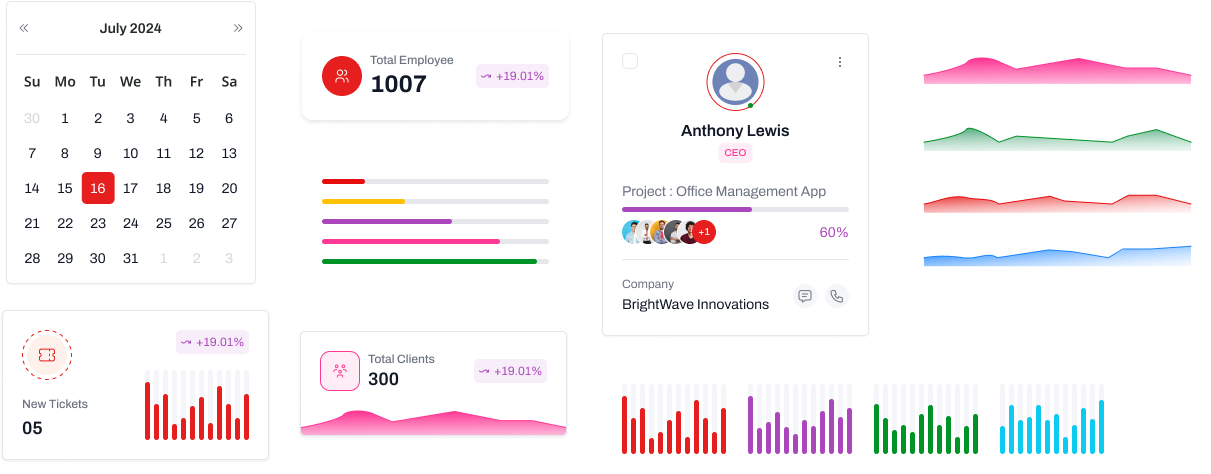
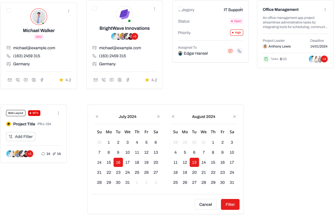
Visual identity and design system
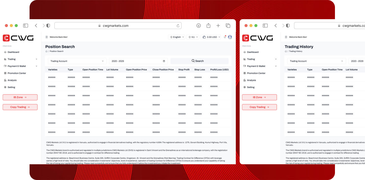
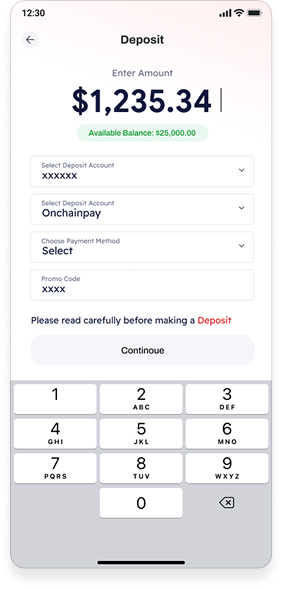
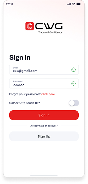
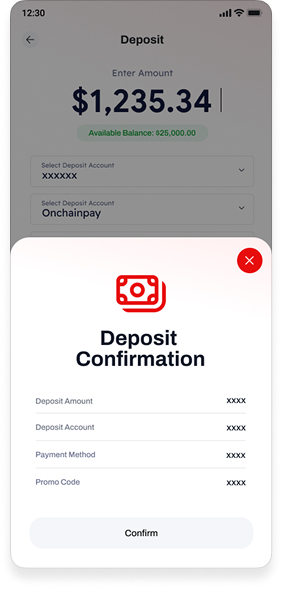
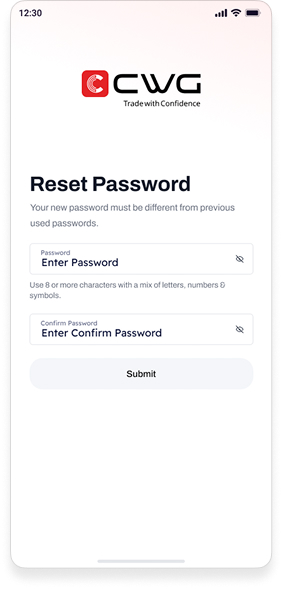
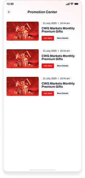
The visual identity is built around clarity, efficiency, and trust. A clean, modern interface keeps reps focused on clients and deals, not on the tool.
Red marks key actions, set against white backgrounds, light gray surfaces, dark charcoal text, and subtle blue accents for interactive elements. The palette looks professional while keeping a distinct CWG identity.
Typography uses a clean sans-serif that stays readable across dashboards, reports, and mobile screens. A consistent spacing system, reusable components, and clear hierarchy keep every part of the CRM coherent.
Every screen follows the same grid, component library, and interaction patterns, so users learn the system once and trust it everywhere. The result is a scalable design system the development team could implement without ambiguity.
Outcomes
Measuring the impact of the redesign
The redesign turned a complex platform into a streamlined daily tool. Clearer navigation, simpler tasks, and better feature visibility lifted adoption, satisfaction, and retention.